Saturday, February 21, 2009

Week 7: Blurt communication

Not much introduction for this one as it the product is an essay. However, it is based on spending a lot of time in the past week or so getting to understand twitter and how it can be useful, and playing the signtific game "Free Space" during the week.

The confluence of various activities I've been involved with and the conversations I had at the AAAS meeting in Chicago brought many ideas into my head all at once. One way this has manifested is the essay: "Blurts: The value of short, rapid, open communication to collective creativity"

Comments encouraged!

Saturday, February 7, 2009

Week 6: Elementary exercises in type

Who'd have thought three hours per week was hard to find? I could have easily made it today except that I spent most of a day beginning to catalogue my books, courtesy of a barcode scanner I acquired during the week, and the very useful goodreads.com. If you want to know what I have on my bookshelves, feel free to take a peek.
While I was digging through my books, I came upon the most excellent The Elements of Typographic Style by Robert Bringhurst. The book itself is beautifully designed and printed, and has more information about typography than you could absorb in a long time of study. Picking it up I recalled that it had a list of the traditional names for the different sizes within a typeface tucked into the margin of a page. I figured that I could play with them a little as an exercise and set a guide to type sizes.

Because these are older names for typefaces, I thought a fairly traditional typeface would be best, and having spent some time reading The New Yorker earlier today, decided that Caslon would suit well. I had Adobe Caslon available so used it.

I chose to set this in a 5"x3" format, with the constraint that I wanted to be able to print it on a laser printer directly onto an index card. That meant 0.5" margins, which definitely constrains some approaches to playing the text, especially with respect to a title for the card.

So that a right-handed person would hold and turn the card easily, I ran the title down the right hand side of the card. A 14-point font meant the title ran the height of the main text block, so I used that for balance.

The automatic leading set by InDesign didn't quite feel right because of the mix of ascenders and descenders so I tweaked that a little to get a good vertical sense of rhythm down the lines, although I'm not sure I have it quite right. 

Using the text figures in the left column didn't feel right with the standard settings so I needed to kern them a little tighter, or else the 10 seemed to stretch far too wide, especially in relation to the 11 below. The mix of ascenders and descenders was particularly challenging to deal with so I had to hang the occasional numeral a little higher or lower. I also played with using titling figures but they just swamped the text given that I set it all lowercase.

And so, at the end of the playing, we have a 5"x3" index card with the old-fashioned names of the font sizes. I suspect that a real typographer could do a lot better but this is all about learning!

Tuesday, February 3, 2009

Week 5: A numerical photographic tour of SLAC

This week's project has been in progress for a little while already but I spent a few hours playing with it this week. 

A couple of years back, an excellent photographer Satoru Yoshioka visited SLAC to take photos for his portfolio. Since then he has been named Best Science Photographer of the Year 2008 by a British photographic society, for his portfolio of work from many of the world's high-energy physics labs. But back when he took photos, I was very taken by his spare style and spent a long time looking at his photos. I noticed in a few photos something that stood out. Many of the locations and facilities at SLAC have numbers painted, engraved, or somehow imprinted on them. And that had some appeal to me that I couldn't quite explain, but I found it interesting.

And so the idea was born: I wanted to create a tour of SLAC by the numbers. I would take a set of photographs on the site of SLAC, each outdoors and containing a number, and then pin them all to a Google Maps layer so that somebody could click through in numerical order or just dash around the virtual site and see a different view of the lab.

I make no claims to being a good photographer. This is more a proof of principle project.

I haven't found all the numbers yet but have posted a bunch of them in a custom map, without any of the real bells and whistles that the Google Maps API would allow, but it's a start.

As time goes on, I'll find more numbers and add more photos, but here it is for now:


View Larger Map

Wednesday, January 21, 2009

Week 4: Essaying on open science and gift economies

This week, I'm creating in a different way. I have had a bunch of ideas floating around in my head about open science and gift economies, and I wanted to refine them. One way I develop my thinking is by trying to put it on paper and seeing where the holes are, what synthesizing ideas come out, and finding out whether I have enough background and understanding to even be tackling the topic. (This works for me in my journalism as well.) 

The great by-product: something is created that can be shared. In this case it is an essay. It's not a physical book, or art piece, and isn't even fiction, but it is still created, and I would argue, creative, despite being somewhat analytical.

The piece is very much still in progress (not in the sense of merely needing refinement but in the sense of only having half the words down on paper). I'll see if I can finish it this week and post it in draft form. For now, I won't say much here except that it tries to explore how the open science movement has the potential to push science culture toward being a gift economy, something that seems to be an ideal for some, but is a long way from reality.

The essay will touch on topics such as open access, peer reviewing, reputation and recognition, outsider science, and the cultural and financial impediments to achieving a gift economy.

Stay tuned!

Thursday, January 15, 2009

Week 3: Haiku of Lost Time

A few years ago I began the Proustku project, living in the blog Haiku of Lost Time. I have revisited it on occasion but really want to spend some more time on this and so I will be using my three creative hours some weeks to make some progress. 

The foundations of the project are outlined in three posts (1, 2, 3) but here is the idea in summary.

I wanted a project to force an active reading of Proust, because it is too easy to just flow through. So in parallel with reading it (or just a little behind) I am writing something per page, to engage myself with the text more closely, to savor the words, the images, and to distill something of the essence, and to provide a counterpoint to the loquacity of the text.

The form I chose has the vague appearance of haiku, but is clearly nothing of the sort. Instead it is a hybrid of form and intent, of purpose and mode, forcing brevity to carry the weight of verbosity. It is a form with only one purpose--this project--and it is called the Proustku.

So for each page of the Enright revision of the Scott Moncrief and Kilmartin translation in the Modern Library Classics edition, I am writing a three-line piece, to capture something of the essence of each page. This will take years to complete, if I make it through, but why not start and see what happens? The benefit is in the doing, but I hope that there is something to get out of the reading. Going back to read over the 67 pieces I wrote in two batches three and then two years ago, I am surprised at how much of the novel these short pieces still evoke. If nothing else, this process is burning Proust in my brain!

I'll probably write these pieces in batches but let them drip out over time, probably one per day. So visit Haiku of Lost Time to view a distilled Proust, reconstituted in a tisane made to soften a madeleine, and evoke a period of reading In Search of Lost Time.

Sunday, January 11, 2009

Week 2: Beginning book binding

For the past few years I've been interested in printing of various kinds, including letterpress printing, with a view to using that technique among others for making artist books. I had been meaning to learn to bind books and had gone as far as reading a lot and acquiring various tools but had never taken the plunge of actually attempting to bind anything. Part of the three creative hours project is about taking that step and doing rather than just planning.

So I collected my bookbinding tools, grabbed a pile of paper and card, and decided to start some simple bindings. I am using Keith Smith's Volume 1: Non-Adhesive Binding as a reference.

A simple pamphlet binding 

To begin, I took half a dozen sheets of letter-sized bond paper and a letter-sized piece of thin card to serve as a cover. I folded the paper in half as a pile, and the cover separately, then marked the spines with a pencil in three locations for the sewing stations. 

I then worked a bodkin through the paper and the cover separately. This was the trickiest part as it is tricky to get all the way through the paper without the pages slipping from each other and without tearing or creasing the paper. The bodkin itself is fairly lightweight so I was a little worried about it breaking as it seemed to bend a lot as I pushed hard enough to get through. However, the bodkin seems quite tough. When I had made the hole for one sewing station, I left the bodkin in place through the hole while I used a second bodkin to make another hole. This helped keep the pages together and aligned.

With the holes made, I prepped the sewing thread by running it over a block of binding wax to stiffen and protect the thread. It also makes it easy to thread through a needle and to actually sew. Following the order of holes in Smith's book, I sewed the binding and tied it all together with a reef knot/square knot. The whole process was really simple although when I finished I found I had left a small loop of thread between the cover and the pages because I hadn't pulled the thread through hard enough. Oh well, it was my first attempt and it was a lesson learned!

All in all, a very simple binding, and yet it looks quite decent. Just to add something extra, I used rubber stamps to add page numbers to the bottom outside corners of the pages so it looks like a notebook. With 24 pages, I decided to make it a mock notebook for chronicling one 24-hour period, the idea being to write/illustrate a page per hour. I'm not sure I'll use it for that, but it's prettier than a blank book for this first attempt.

A simple Japanese stab binding

Then on to a more complex binding, and the next step I wanted to try for the main task at hand. I decided to try out a Japanese stab binding on a small format book. I had plans to make something roughly 3"x5" so decided to make a small book from index cards and bond paper. I cut a few sheets of bond paper into 3"x5" pieces as the pages for the book and used index cards as the cover stock.

I marked another index card with the locations of the sewing stations and placed it on top of the complete pile of covers and pages. I punched the holes with the bodkins again and started sewing again as per instructions. This binding starts from the middle of the book block with a tail of thread hanging out to use for tying off later. 

An obvious lesson but one I still managed to nearly mess up is cutting enough thread to ensure you can sew the whole book. There are ways to add thread if you are short but it is inelegant. I only just had enough thread to tie the knot but it was a close call. The estimate of using three times the height of the book block wasn't quite enough to be comfortable for this binding. 

The trickiest part of the process was finishing the sewing by extracting the thread at the midpoint of the book block. With the spine sewed tightly, it was hard to get the pages far enough apart to extract the needle through the middle without tearing pages but it worked out after a little persistence.

Tying a knot and then pushing it into the spine hides it reasonable but there is still a bulge in the spine at the location of the knot so it doesn't seem ideal. There must be some better way to tie off the sewing with a less obvious result. The finishing doesn't need to be perfect-- part of the beauty of a handmade object is the appearance of it being handmade, and yet I still think there must be a better solution.

The binding itself seems to hold quite well and I'm surprisingly pleased with how it came out and how easy this has been.

Now on to the part of the project I was aiming for: making a miniature edition of an issue of my magazine, symmetry

A miniature magazine edition

To make something a little more "real" than just binding blank pages but without committing to an elaborate printing project while learning to bind, I decided to make an edition of something that already existed. The real version of symmetry is 11"x7 3/8" but a stab binding at that size would seem a little odd given the original is perfect bound. A smaller format would seem to work for this project, however.

I printed out the pages of symmetry from the PDF on 3"x5" index cards, double-sided. It would have been best to print from the pages with printer's markings so I could cut them to deal with the bleeds and alignment issues of printing on both sides of a card just from a color laser printer. However, this will do for now. I used a guillotine to cut down the cards to trim the unprintable white area from the top, bottom, and outsides of the pages, leaving the inside for the binding area. I then scored the left hand side of each page to make it easier for the pages to open once bound.

Making the holes was a little trickier in this case because there were 18 index cards to get through but by using bulldog clips to hold the pages together and working hard at it, it worked out. I made a template on another business card to punch through to ensure the holes were in the right places! The first two holes didn't have clips in place so the second hole went through at a slight angle as the pages slipped but it wasn't too bad.


With the holes made, it was time to sew and a few minutes later, I had a bound small edition of symmetry!


Thursday, January 1, 2009

Week 1: Stamping letters and numbers


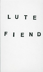
I started playing with rubber stamps last year as a way to experiment with simple placement of letters and numbers on a blank page. It's not exactly fine typography, but helps me understand a little more about how placement of characters has its effect. Apart from that, it is also quite fun!

Primarily, the cards are a way to experiment without overthinking, as each is done very rapidly. Each draws on some gut feeling for how the page might work. In my experiments so far, those done fastest and with the least thought have turned out to be the most effective in hindsight.

I use individual rubber stamps and a small stamp pad, stamping each letter one by one. That gives a very haphazard look to the letters and stops them being nicely aligned, but brings out the individuality of the letters, something I am looking to do here. I am stamping on cheap 3"x5" plain index cards and working fast just to see how they come out. I'll scan them all and post them one each day on a separate blog. Your responses to them are very welcome!